top of page

Zettawatts
Website Redesign
I redesigned Zettawatts’ website to better align with their brand and product experience, creating a more cohesive and intuitive interface. The updated design enhances ease of navigation while establishing a more credible, professional presence.
Project Type
Applications
Keywords
Website redesign
UI components
Figma
Adobe Illustrator
Wix
Gradient
Cohesive
Credibility
Interviews
I began the project by conducting stakeholder interviews with the Zettawatts team to understand what was working within the existing website and identify key areas for improvement. I then cultivated all the answers into six key categories.
Content & Messaging
-
Hero/header: highlight energy goals, solutions, and Microsoft requirements
-
Consider emphasizing an easy, tailored path for customers, acknowledging process complexity
-
Messaging should not overly lean toward Microsoft; should appeal to broader audience (Meta, Google, etc.)
-
Future-proof messaging for evolving standards (GHG protocol, SBTI)
-
Simplify copy for non-experts (many users are from operations, finance, not sustainability positions)
Design
-
Lighter color palette (avoid heavy black); more white space
-
Explore typography and structural play
-
Incorporate UI elements from product/app into the website
-
Add more CTAs beyond "Sign Up" (ex. Book Demo, browse projects, etc.)
Audience-Specific
Pages and Personas
-
Separate pages for
-
Customers (buyers)
-
Developers
-
Partners (NRCO, Microsoft, others)
-
-
Each audience flow: clear actions (ex. Book Demo, create account, list project, etc.)
-
Potential "For Developers" button next to "Book a Demo"
Information
Architecture
-
Two potential structures
-
By audience type with relevant sections
-
By product flow and how each audience interacts
-
-
Updated "How it Works" pages - potentially separate per audience
-
Updated "About" page
Behavioral Science
& Marketing
-
Leverage social norming
-
Highlight credibility while maintaining broad appeal
-
Avoid overloading landing page; guide users with problem - alternatives - solutions journey (PAS model)
Additional
Considerations
-
Banner for Microsoft suppliers, but not dominant
-
Clarify ARECs for newcomers (visual breakdown, plain-language explanation)
-
Bring app/staging elements into website for cohesion
-
Offer solutions for both small and large companies (Scope 2 and Scope 3 solutions)
-
Developers: more focus on project explorer and selling ARECs
User Journeys
I prioritized the customer and developer user journeys, as they represented the highest-traffic pathways on the website. For the customer experience, I defined two key personas: users in sustainability-focused roles and users without a sustainability background.
_edited.png)

_edited.png)
Goal
The goal for the homepage and subpages is to instill trust that Zettawatts' website is a legit solution for both Microsoft and non-Microsoft customers to meet their requirements.
The approach also aligned the website with Zettawatts’ product experience, reinforcing credibility and simplifying navigation.
Sitemap
I began mapping out the content of the homepage after confirming the current website's sitemap, using it to set the foundation for the site’s overall design system and component structure.

1st Round
_edited.jpg)
%20(1)_edited.jpg)
2nd Round
%20updated_edited.jpg)

Homepage Final Design
The final homepage serves as the foundation of the Zettawatts digital experience, designed through validated user journeys and sitemap analysis. The layout prioritizes high-traffic pathways and surfaces key information early, guiding first the Microsoft customers, while also featuring solutions for non-Microsoft customers. Refreshed content, clean layouts, structured grids, and a cohesive typographic system establish a modern, credible visual language that aligns the website with the product experience. Modular UI components and a unique color/gradient palette ensure consistency and scalability, reinforcing trust in Zettawatts as a reliable clean energy marketplace.
Landing Page
Updated horizontal
menu bar, featuring a new "Partners" section
Header & subhead with Microsoft language + call to action button

Landing imagery are quotes from actual customers + counter-social proof section
Scroll down
Microsoft Critera
Steps to achieve Microsoft's criteria

Video explaining how Zettawatts can satisfy Microsoft's criteria
Scroll down
Call-To-Action
Button that leads to a new page to access quote

Example of a quote form with prices blurred - form is also clickable which leads to the same page to access quote
Scroll down
Other Persona Cards + Zettawatts Team
Persona cards for non-Microsoft customers, leading to other dedicated subpages

An introduction to the Zettawatts team
New Homepage

Old Homepage (retired)


Subpage Final Designs
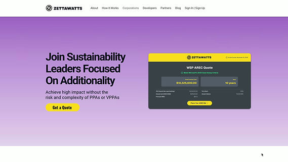
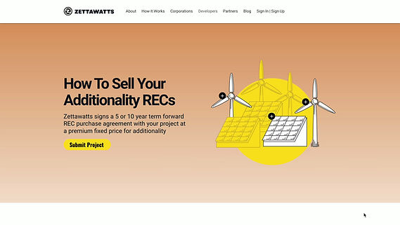
The final subpages carry forward the homepage’s visual language and structural system. Each page is distinguished by its own bold, eye-catching gradient, creating clear visual separation between sections while reinforcing a cohesive, thematic experience across the site.
A completely new page dedicated to the partners of Zettawatts has also been added to the website's page collection.
New "About" Page

Old "About" Page

New "How It Works" Page

New "Corporations" Page
New "Developers" Page
Old "How It Works" Page

Old "Corporations" Page
Old "Developers" Page

New "Partners" Page

New "Blog" Page

Old "Blog" Page

Aabbcc Roboto
Aabbcc Inter
bottom of page