top of page

Zettawatts
UI Component
I designed a scalable global header for Zettawatts' application that establishes a clear visual hierarchy and strengthens the platform's credbility as a clean energy marketplace. The component unifies navigation, search, and account actions into a streamlined layout. I focused on clarity, accessibility, and brand coherence - using Zettawatts' core gradient system, clean button, and consistent spacing to create a header that feels modern, trustworthy, and easy to navigate.
Project Type
Applications
Keywords
Website header UI
Figma
Gradient
Consistent
Credibility
Simple
Research And Sketches
I reviewed Zettawatts’ navigation and key user flows to identify where the header needed clearer structure. I also looked at clean-energy platforms, B2B SaaS tools, and marketplaces for inspiration and common patterns. From there, I sketched quick layout and interaction ideas—including button placement and hamburger menu options—which helped define an intuitive header aligned with the Zettawatts brand.


Problem
Zettawatts’ existing header lacked a clear navigation structure, making it difficult for users—especially sustainability managers and energy developers—to quickly understand where to go. Important actions were buried, labels were inconsistent, and the middle-aligned header didn’t scale well as new pages and product areas were added. Overall, the experience felt fragmented and didn’t fully communicate the platform’s hierarchy, creating friction at the very first touchpoint.
Goal
The goal is to create a header that clarifies navigation for all user groups, reinforces credibility through clear hierarchy, and applies Zettawatts’ brand gradients, spacing, and typography consistently.
Design Journey
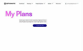
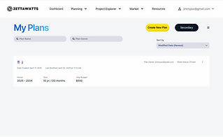
After the first initial sketches and testing multiple layout directions, I started off with three concepts - main, completely different, and experimental. I refined the concepts into four rounds of wireframes that explored different hierarchies, spacing systems, structures, and interaction patterns. From there, I built the component using consistent design tokens - typography, color, spacing, and iconography - to ensure it could scale across the entire site.
1st Round


2nd Round


3rd Round


Final Design +
Key Takeaways
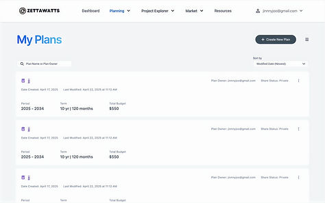
The final header organizes Zettawatts into a few clear, action-oriented buckets—My Plans, Project Explorer, and Project Lists—with dropdowns that can scale as new workflows are added. The app pages now uses a left-aligned title, a primary CTA button, and supporting controls (search, sort, view toggle, chip dropdowns) that feel consistent across the app. The Plan information is surfaced in card rows rather than a dense table, making key fields like period, term, budget, owner, and share status easier to scan and reinforcing credibility through transparent metadata. Throughout, I applied Zettawatts’ blue and orange gradient system, consistent spacing, and typography to tie the header, controls, and content into a reusable pattern that can be extended to other modules.
Old Design
New Design
vs



Aabbcc Roboto
Aabbcc Inter
bottom of page